
You have something useful to explain, but appearing on camera is not part of the plan. Fair enough. A clear explainer does not need a talking head, dramatic hand gestures, or a bookshelf arranged to suggest you definitely read all those books.
This is for business owners, marketers, educators, and creators who need to explain a product, service, process, or idea with visuals and narration instead. It is not about making a cinematic short film. The goal is a video that makes one useful point easy to grasp.
You will learn how to narrow the message, write words that sound natural aloud, choose visuals with an actual job to do, record usable narration, and edit without burying the explanation under effects. By the end, you should have a practical process for producing a faceless explainer people can follow on the first watch.
Start With One Clear Problem and One Useful Outcome
Start with a person in a situation, not a topic. “Small business owners who need to explain online booking to customers” is useful. “Anyone interested in business” is a fog bank. Pick an audience that shares one immediate problem, then use the words they would use to describe it. A faceless video has no presenter’s personality to rescue a vague message, so the plan has to do that work first.
Explain one problem that can be shown and resolved in a few steps. Good subjects include how to submit an expense claim, why a password reset is failing, or what happens after someone places an order. “Everything our software does” is not an explainer, it is a hostage situation with background music. If the viewer needs several different answers, make several videos.
Decide on one useful outcome before writing anything: by the end, viewers should understand a process, recognise a cause, or complete a specific action. Write that outcome as a plain sentence, such as, “The viewer can connect their calendar and choose available appointment times.” It gives every later choice a test: if a line, image, or example does not help deliver that result, remove it.
For a first explainer, aim for roughly 60 to 90 seconds. That is enough room to name the problem, show the key steps, and state what to do next without cramming the screen with tiny text. A process that genuinely needs more detail can run longer, but split it once it starts answering separate questions. Short is useful only when it remains understandable; speed-reading a manual over stock footage is still a manual.
Write a Script That Sounds Like a Person, Not a Help Document
A useful explainer video script has a small job: get the viewer from “I have this problem” to “I understand the next step.” Start with a hook that names the frustrating or costly moment, then explain the problem in plain terms. Introduce the useful outcome or method, walk through one concrete example, and finish by telling the viewer what to do or remember. That is the whole video script template. You are not writing the director’s cut of your company history.
For a one-minute explainer, aim for roughly 120 to 150 spoken words. The right number changes with pauses, product names, screen labels, and how quickly the narrator speaks, so treat it as a planning range rather than a stopwatch guarantee. A script that looks comfortably short on a document can become surprisingly long once a real human has to say “customer relationship management platform” three times. Read it aloud with a timer before building the video.
Write for the ear, not the page. Use short sentences, contractions, ordinary verbs, and one idea at a time. “Our tool helps you send follow-up emails after a quote” sounds more natural than “Our platform facilitates post-quotation customer communication.” If a sentence makes you run out of breath, split it. If you would never say a phrase to a colleague, replace it. Reading the draft aloud is the quickest test: awkward wording announces itself immediately, usually with the enthusiasm of a smoke alarm.
Cut throat-clearing introductions, broad claims, repeated points, long feature lists, and details the viewer does not need to grasp the main idea. Remove filler such as “we’re excited to announce,” then remove the sentence that explains why you are excited. Keep only words that move the explanation forward: the problem, the mechanism, the example, and the ending. Some video tools can generate editable scripts before rendering, which can be a useful starting point, but the final pass still needs a person who knows what the viewer actually needs to hear.
Choose Visuals That Explain the Words Instead of Decorating Them
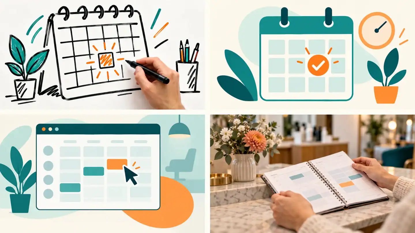
Use the visual that proves or clarifies the sentence you have just said. If the narration says, “Here’s where the customer changes their billing details,” show the actual settings screen or a short screen recording of that action. If it explains a process with several moving parts, use a simple diagram that highlights one step at a time. If it describes a physical result, stock footage or a still image may help. The visual has a job. If it could be swapped with footage of someone staring thoughtfully out of an office window, it is probably decoration.
Screenshots are best for software, websites, documents, and anything the viewer may need to recognise later. Screen recordings are better when the order of clicks matters, but keep the cursor purposeful and trim waiting, typing mistakes, and menus that do not support the point. Stock footage can give an abstract idea some human context, particularly for topics like stress, teamwork, delivery, or travel. It becomes unhelpful when the narration is specific and the footage is merely “person using laptop,” the visual equivalent of putting parsley beside every meal. Animation and simple illustrations work well for invisible ideas, such as data moving between systems, a timeline, or a before-and-after comparison. A whiteboard style can also suit a step-by-step explanation, and whiteboard-animation tools such as Doodly advertise whiteboard, blackboard, glassboard, and green-screen styles.
Match the script beat by beat before editing. Put each spoken point in one column, then write the evidence or image that would make that point easier to understand in the next. A claim about a feature needs the feature on screen. A statistic needs a readable chart or a large number with context. A comparison needs both sides visible at once. A transition can use a brief visual reset, but it does not need a spinning logo, particle burst, and a small weather system. Reuse a visual only if it still explains the current sentence; repetition is less distracting than unrelated motion.
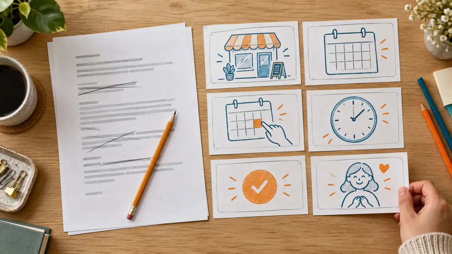
Keep on-screen text short enough to read without pausing. Use it for names, key phrases, steps, figures, and a sentence the viewer should remember, not as a duplicate transcript of the narration. One clear phrase beside a relevant screenshot usually beats six lines of tiny text fighting a moving background. If viewers need to read a detailed list, slow the video down, show one item at a time, or provide the detail elsewhere. The narration should carry the full thought, while the screen supplies the proof, structure, or mental picture.
Pick a Format That Fits What You Need to Explain
For software, start with a screen-recorded tutorial. The product is the visual, so showing the actual buttons, fields, and result removes a layer of interpretation. It works especially well for a step-by-step process: open this menu, choose this setting, see what changes. Animation is better when the interface is not the point, such as explaining why a service exists before showing how its dashboard works.
Screen recordings beat animation whenever the viewer needs confidence that a task is real and repeatable. A short software demo can show the path from blank screen to finished action with very little fuss. Keep the cursor purposeful and zoom in only where a detail is genuinely hard to see. Nobody needs a cinematic pan across an account-settings page.
Whiteboard explainers are still useful for abstract ideas, service models, training concepts, and stories with a clear sequence. The drawing-on effect can make a process feel easier to follow because each idea arrives one piece at a time. It is less convincing for a software walkthrough, where a hand drawing a pretend dashboard is usually a detour. Doodly is positioned as desktop software for making doodle-style whiteboard videos, with blackboard, glassboard, and green-screen formats also advertised. Readers weighing that style can see the practical tradeoffs in our Doodly review.
For a first video, slide-based visuals or kinetic text are usually the simplest route. Put one thought on each slide, use a few icons, screenshots, or simple diagrams, and let narration do the explanatory work. Kinetic text, meaning words that move on screen, suits short claims and statistics but becomes tiring if every sentence arrives like it has won a talent contest. Stock-footage edits can add atmosphere for service businesses, yet they need a careful script and specific on-screen text or they quickly become footage of strangers shaking hands near a suspiciously bright window.
Record Narration That Is Clear Enough to Carry the Video
You do not need to use your own voice. A clear human voice can make a simple explainer feel more personal, but it is only the right choice if you can speak comfortably and the voice fits the audience. A colleague, freelance narrator, or text-to-speech voice can work just as well if the delivery is easy to understand and suits the subject. The narration’s job is to guide the viewer through the idea, not to prove that you own a studio microphone.
For a home voiceover, finish the script first, then record somewhere soft and quiet: curtains, carpet, cushions, and a closed door all help reduce the hollow room sound that makes even good advice feel like it was delivered from inside a bathroom. Put the microphone close enough to capture your voice clearly, but not so close that every P and B arrives with weather effects. Turn off fans and notifications, record a short test, and listen through headphones before committing to the full read. Record one scene or paragraph at a time, leaving a second of silence at each end. Retaking one awkward sentence is far less painful than redoing a three-minute narration because the dog chose its moment.
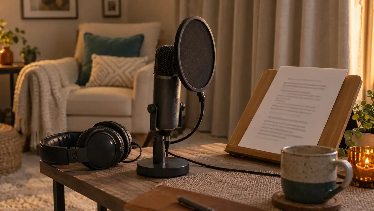
Stiff narration usually comes from reading words rather than explaining an idea. Mark pauses in the script, slow down slightly at new terms, and imagine speaking to one capable person rather than addressing an invisible auditorium. Read a section twice, then keep the take that sounds clearest, not necessarily the most theatrical. Text-to-speech is a reasonable option for an explainer video, particularly for screen recordings or animated videos, but choose a voice that matches the topic and edit the script for speech: shorter sentences, ordinary punctuation, and no cramped lists of jargon. Some editors support recording or uploading narration directly. For example, Doodly says users can record a voiceover in the editor or upload an externally made audio file, then synchronize it with the animation.
Assemble the Video One Scene at a Time
The easiest editing order is narration first, visuals second, polish last. Put the finished voiceover on the timeline, listen for each new idea, then build one scene around that idea. This keeps the video explanatory rather than decorative, which is how you avoid spending an hour animating a coffee cup while the narrator is explaining account permissions.
Recording the voiceover before adding visuals is usually the sensible choice. It gives every scene a real length and makes gaps, repeated points, and awkward wording obvious while they are still cheap to fix. If the script changes, revise the audio first, then adjust the scene that supports it. Some editors can generate captions, tighten dead air, and add punch-ins automatically, but automatic is a starting point, not a tiny unpaid editor with perfect judgment. Read the captions and correct names, terms, and line breaks yourself.
There is no useful fixed number of seconds for a scene. Keep it up only for as long as the viewer needs to understand the point, then change it when the narration moves to the next meaningful idea. A simple screenshot may need time for the viewer to find the button being discussed; a title card usually needs only enough time to read it comfortably. If viewers need to pause to read the on-screen text, shorten the copy, enlarge it, or split it across scenes. Captions should support the spoken words rather than compete with a second paragraph of tiny type.
Background music is optional. A quiet, uncomplicated track can make pauses feel less abrupt, but it should sit well below the narration and disappear entirely if it makes speech harder to follow. Transitions are optional too. A clean cut is often the clearest choice, especially between steps in a process. Use a fade or other transition only when it signals a real change, such as moving from the problem to the solution, not because the editor has offered 40 page-turn effects and expects them all to find homes.
Finish with a clarity pass. Watch once with the sound on to check that every visual arrives when it is mentioned. Then watch with the sound off to see if the captions, labels, and screen actions still make sense. Finally, remove anything that does not explain, orient, or give the viewer a moment to absorb the point. Explainer videos improve quickly when each scene has one job and no interest in becoming a short film.
Check the Video Like a First-Time Viewer
Watch the finished video once with the sound off, then once without looking at the screen. The first pass exposes text that is too small, scenes trying to explain three things at once, and visuals that do not match the narration. The second catches rushed delivery, volume jumps, awkward pauses, and sentences that only make sense because you can see the screen. If the opening does not quickly state the problem and the useful outcome, rewrite it. A first-time viewer has not kindly memorised draft nine.
Add captions, especially for a faceless video. They make spoken points easier to follow when audio is unavailable or imperfect, and they give key terms a second chance to land. Keep captions accurate, timed to the speech, and large enough to read on a phone. Automatic-caption tools can save time, but review names, numbers, and unusual words. Those are precisely the bits automation likes to turn into modern poetry.
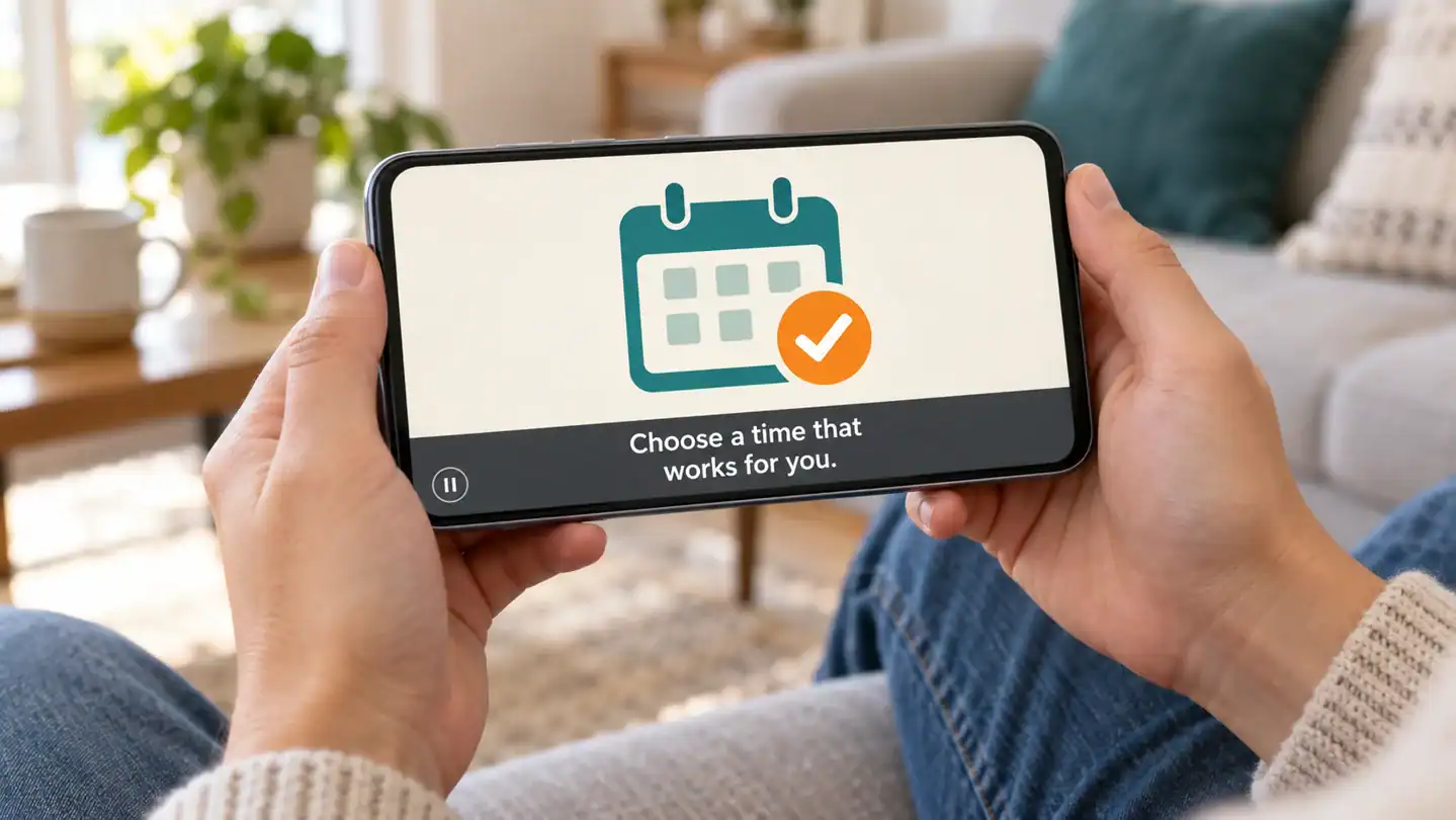
The most common explainer-video mistake is trying to say everything. A crowded scene, a wall of text, or a visual that merely fills space makes the viewer work harder than the topic requires. Before publishing, check:
– The first few seconds make the subject clear. – Every scene supports one spoken idea. – Text is readable on a phone and stays on screen long enough. – Visuals clarify the narration rather than compete with it. – Music sits below the voice, and audio levels stay even. – Captions are accurate and unobtrusive. – The ending gives one clear next step, such as visiting a page, trying a process, or contacting you.
